KP Corp2022
Redesigning KP Corp’s website for its shift to digital services
KP Corp was moving from commercial print into data-driven communications, and its website hadn’t caught up. As the only designer on the project at Ten Gun Design, I redesigned the whole site, from wireframes to the visual system, responsive layouts, and scroll and hover interactions. It is still KP’s live site today. Visit KP Corp’s current website (opens in a new tab)
- Shipped
- UX design
- Visual design
- Web
- Role
- Digital Designer Sole designer
- Timeline
- Jun – Sep 2022
- Team
- Ten Gun Design Art Director, Project Manager, Developers, QA
- Platform
- Responsive web
- Tools
- Figma, Adobe Creative Suite, InVision
- Sole designer on the project
- Ten Gun Design, June–September 2022
- Still live today (opens in a new tab)
- kpcorp.com runs on this design
- $80–100M annual revenue (opens in a new tab)
- From KP’s 2023 business update
Situation
KP was growing into data-driven communications. Its website still looked like a print shop.
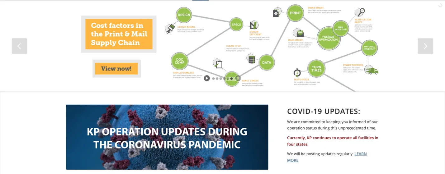
KP Corporation built its business on commercial print and mail. By 2022 it was selling data-driven, multichannel communications to regulated industries, but its homepage opened on a carousel of campaign graphics and a pandemic notice, and spread the offer across seven menu items.
Ten Gun Design took on the redesign, and I was the only designer on the project, from the first wireframes to the visual system and every interaction.
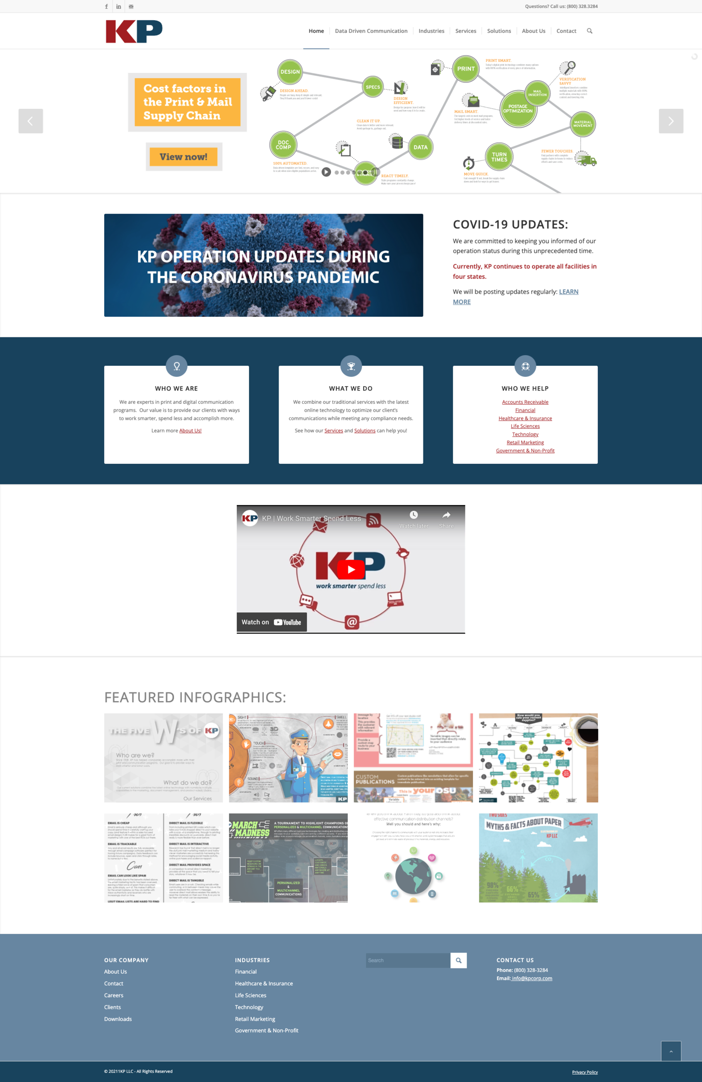
The homepage the redesign replaced.
Target users
Two kinds of buyers, and a site that works like a sales rep.
The audience plan named two groups: production, communication, and procurement teams who already knew KP for print, and technology, data, governance, and risk teams meeting KP for the first time. The client summed up the brief in one line: “The web site should be out front for reps.”
What buyers need to find
- 01
Is this the company I think it is?
New buyers expected a technology partner. Longtime customers expected the KP they knew.
- 02
Where do I start?
Buyers arrive with an industry or a service in mind, and seven menu items didn’t say which was which.
- 03
Do you understand my industry?
Regulated buyers want proof that KP knows their requirements before they get in touch.
- 04
What exactly do you do?
The offer now ran from print to data, and it needed to read as one range.
- 05
Does this look like a technology partner?
The brief asked for expert, modern, and credible, and the old site said “print” in every graphic.
- 06
Does it work on my phone?
A link a rep sends is often opened on a phone, between meetings.
Design decisions
One promise up front. Every section answers a buyer’s question.
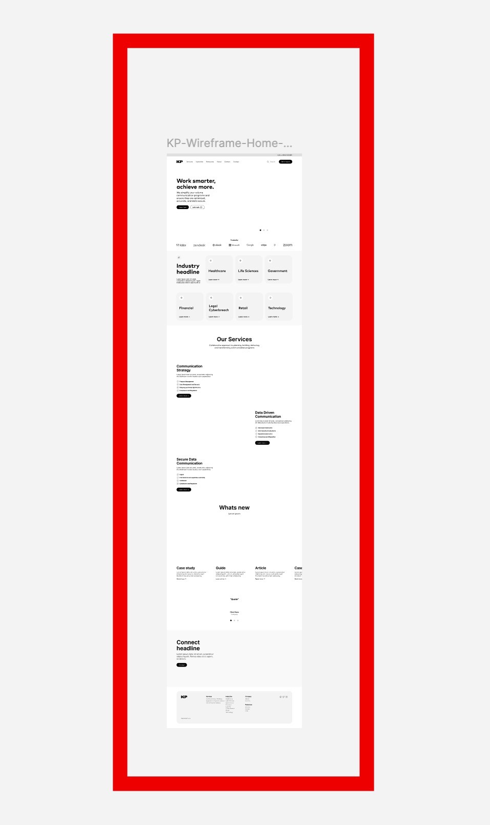
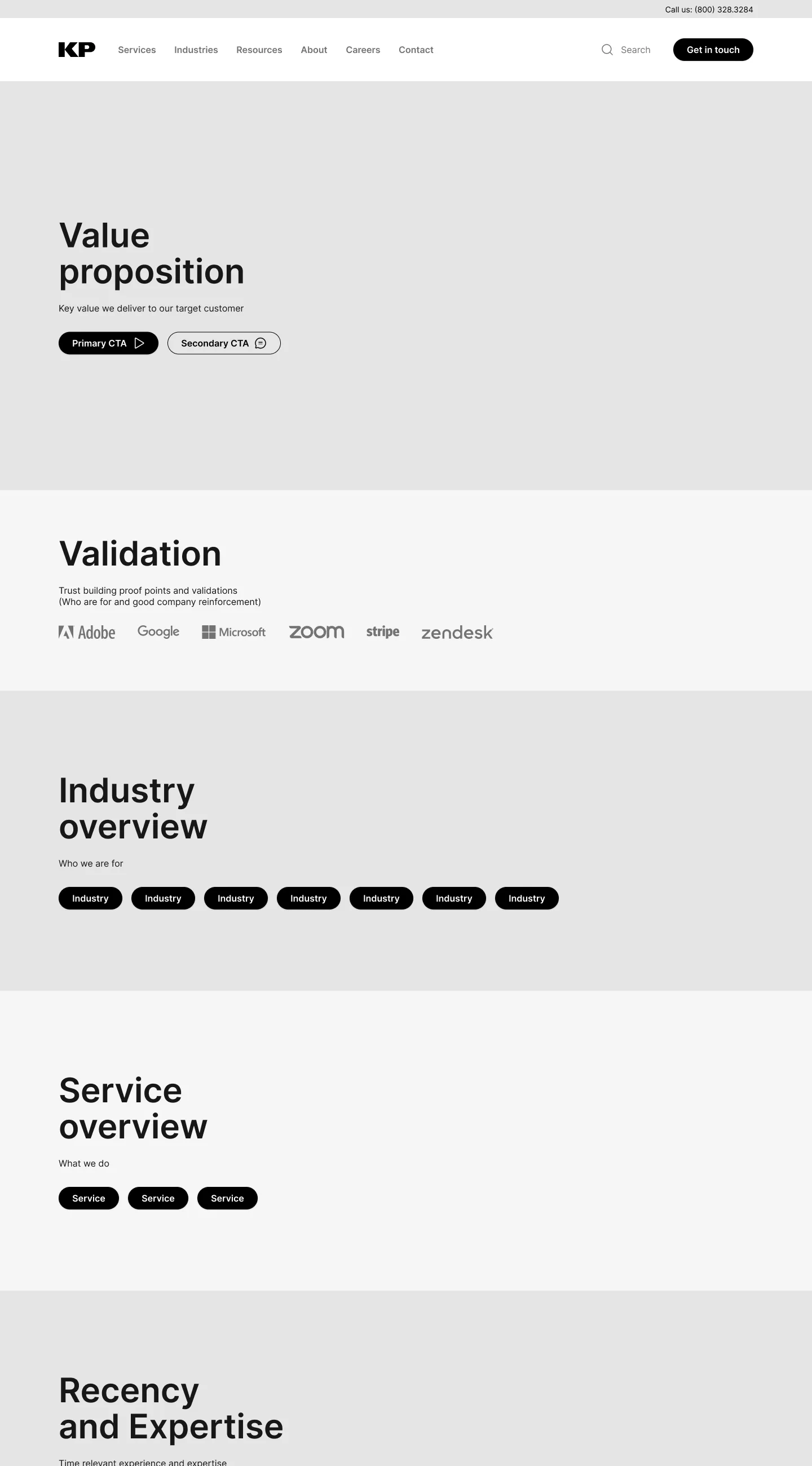
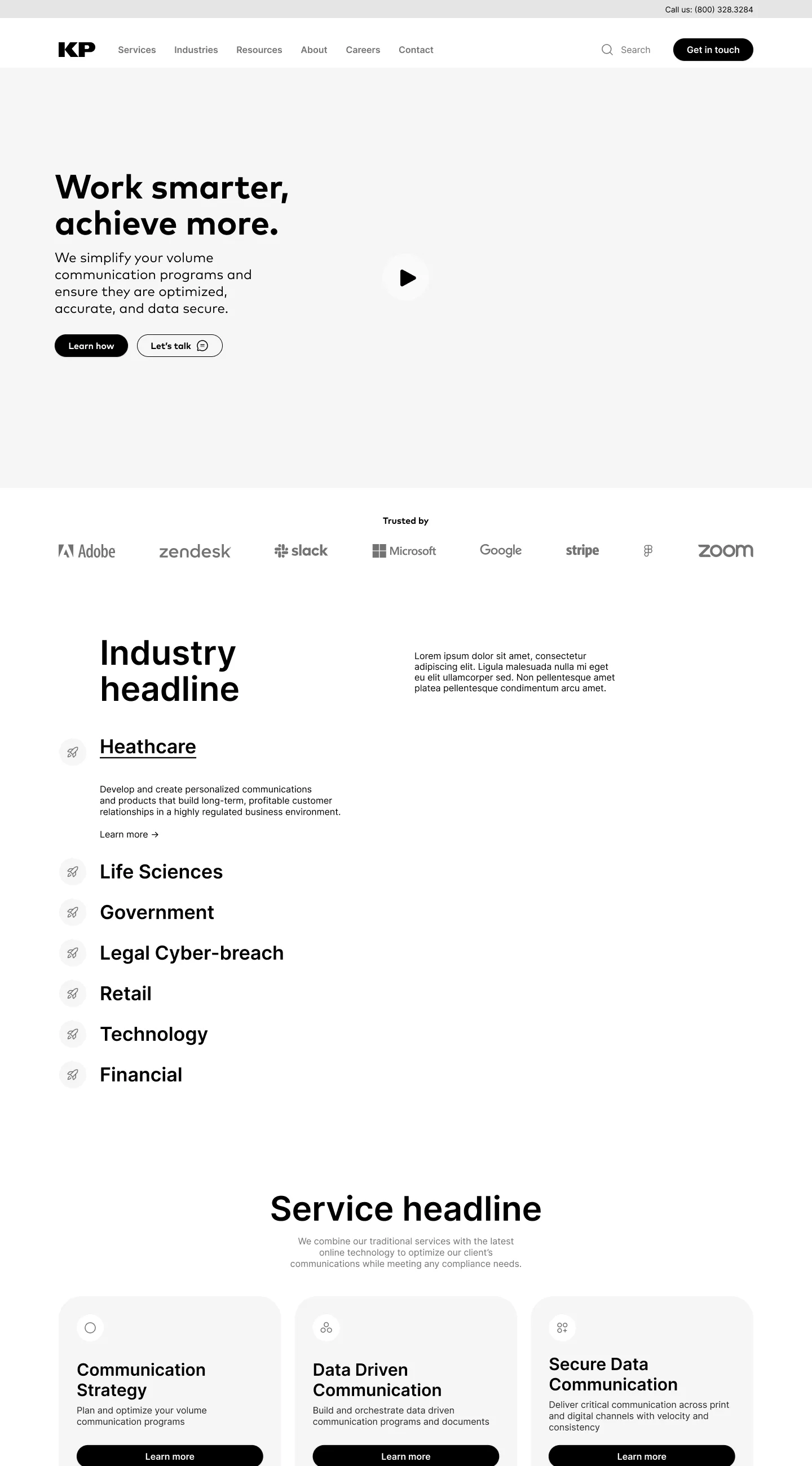
The audience plan and sitemap came from the strategy team. On top of them, I designed every page, from wireframes to the visual system and its motion. Before the final visuals, I took the homepage from content blocks to two wireframe directions. Where I turned a direction down, switch between the two to see it.
01Content blocks: what each section has to say
02Wireframe: the direction I chose
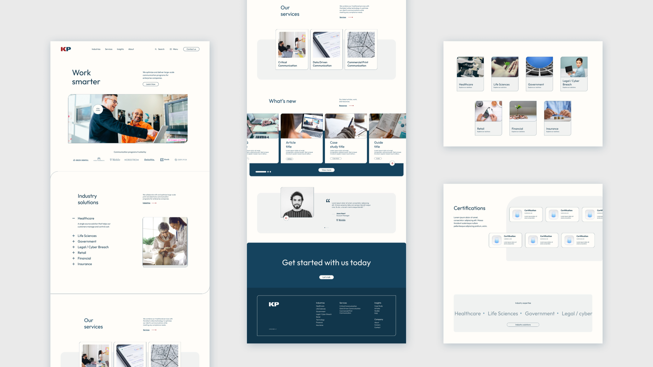
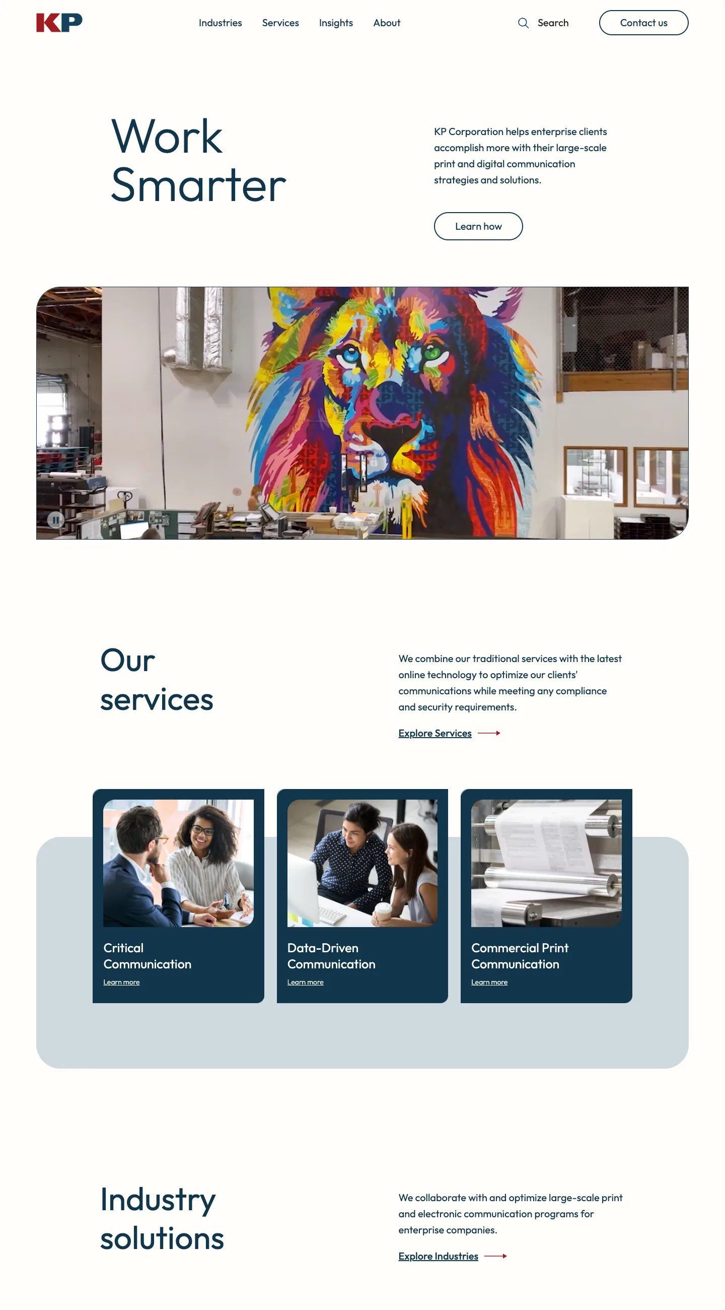
03Shipped: kpcorp.com today
Decision 01: Is this the company I think it is?
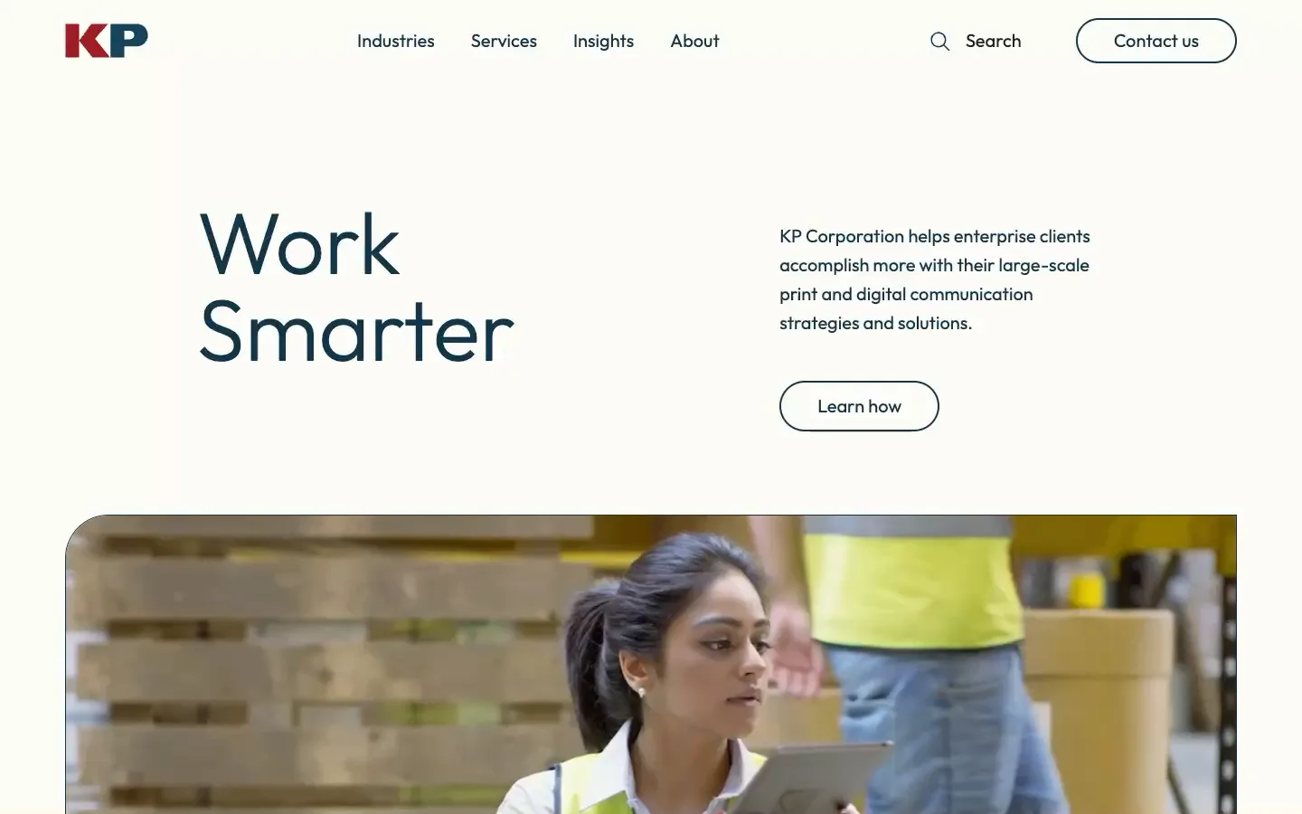
Lead with one promise, and show the real production floor.
What I chose
The hero says one thing, Work Smarter, next to a single line on what KP does, over footage of KP’s own floor and team. Client logos follow right below it.
What I rejected
The old homepage opened on a rotating carousel of campaign graphics, followed by a pandemic operations notice.
Why
New technology buyers needed to see a modern partner, and longtime print customers needed to recognize KP. One clear promise over real footage serves both, and the logos back it up before anyone scrolls far.
Decision 02: Where do I start?
Four doors in, each explained before you click.
What I chose
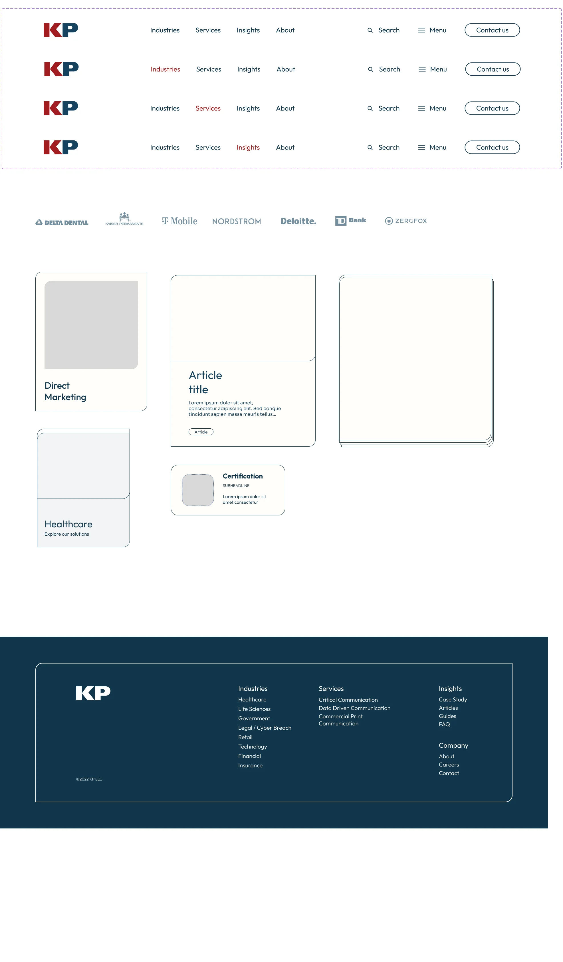
The header comes down to Industries, Services, Insights, and About, with search and Contact always in reach. Each opens a menu that names every option and says in one line what it covers, with the columns easing in one after another.
What I rejected
The old header spread seven items across the top, from Data Driven Communication to Solutions, with no hint of what sat behind each.
Why
The audience plan showed buyers arriving by industry or by service. Fewer, clearer doors get both to the right page, and the one-line descriptions start the sales conversation before a rep joins it.

Decision 03: Do you understand my industry?
Open one industry at a time, with its photo on a stacked card.
What I chose
Industries sit in a list. Opening one shows a short pitch and a Read more link, and swaps the photo on a stacked card beside it, so the section feels like flipping through a file.
What I rejected
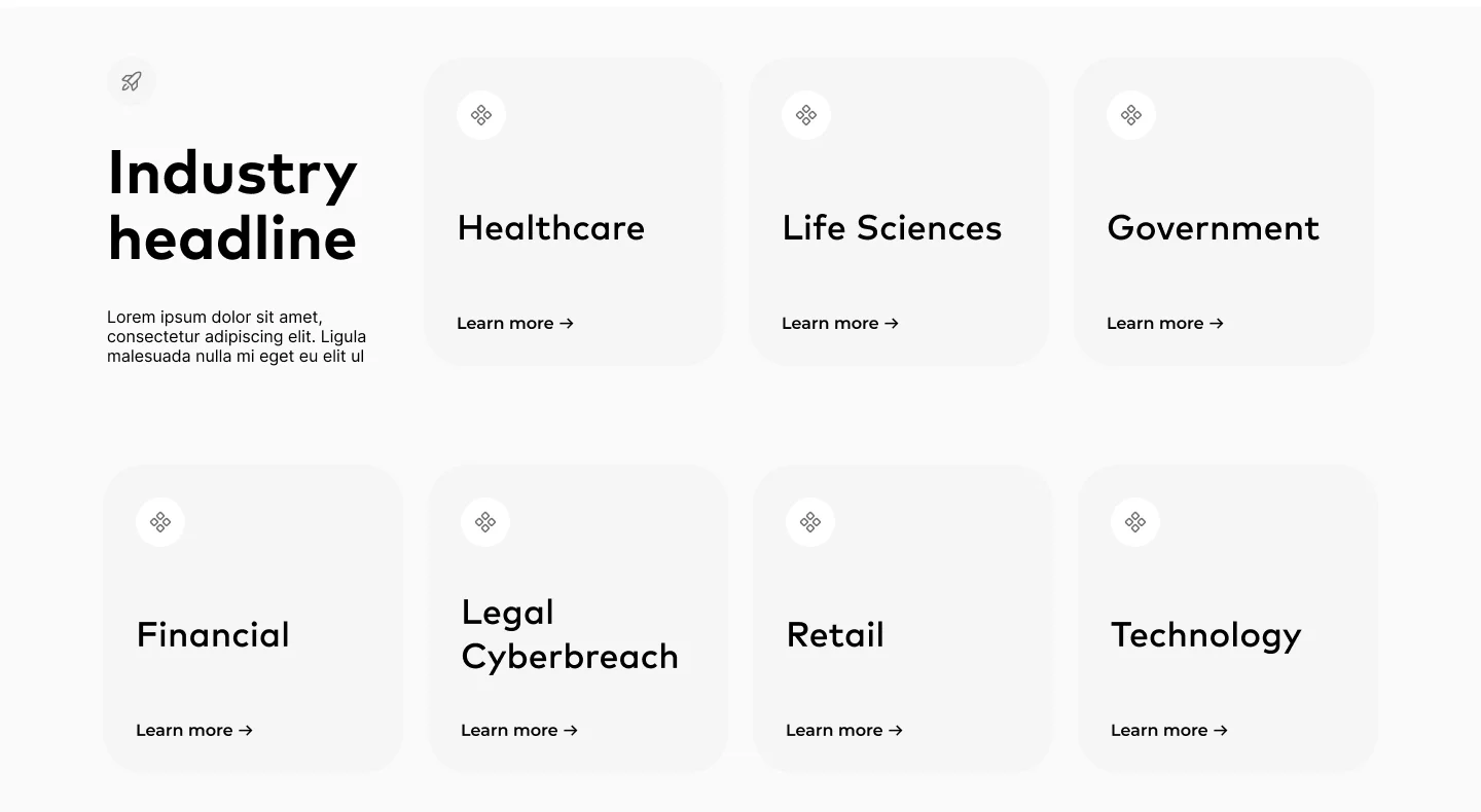
My other wireframe gave each of eight industries its own tile. It was quick to scan, but every tile said only a name and Learn more.
Why
Buyers in regulated industries ask whether KP understands their requirements. A one-line answer for each industry, on demand, says more than eight equal tiles, and keeps the section short.
Decision 04: What exactly do you do?
Three service cards that lift into a stack on hover.
What I chose
Three cards rise out of a gray band. Hovering one lifts it, fans a stack of sheets beneath it like printed pages, and reveals what the service covers.
What I rejected
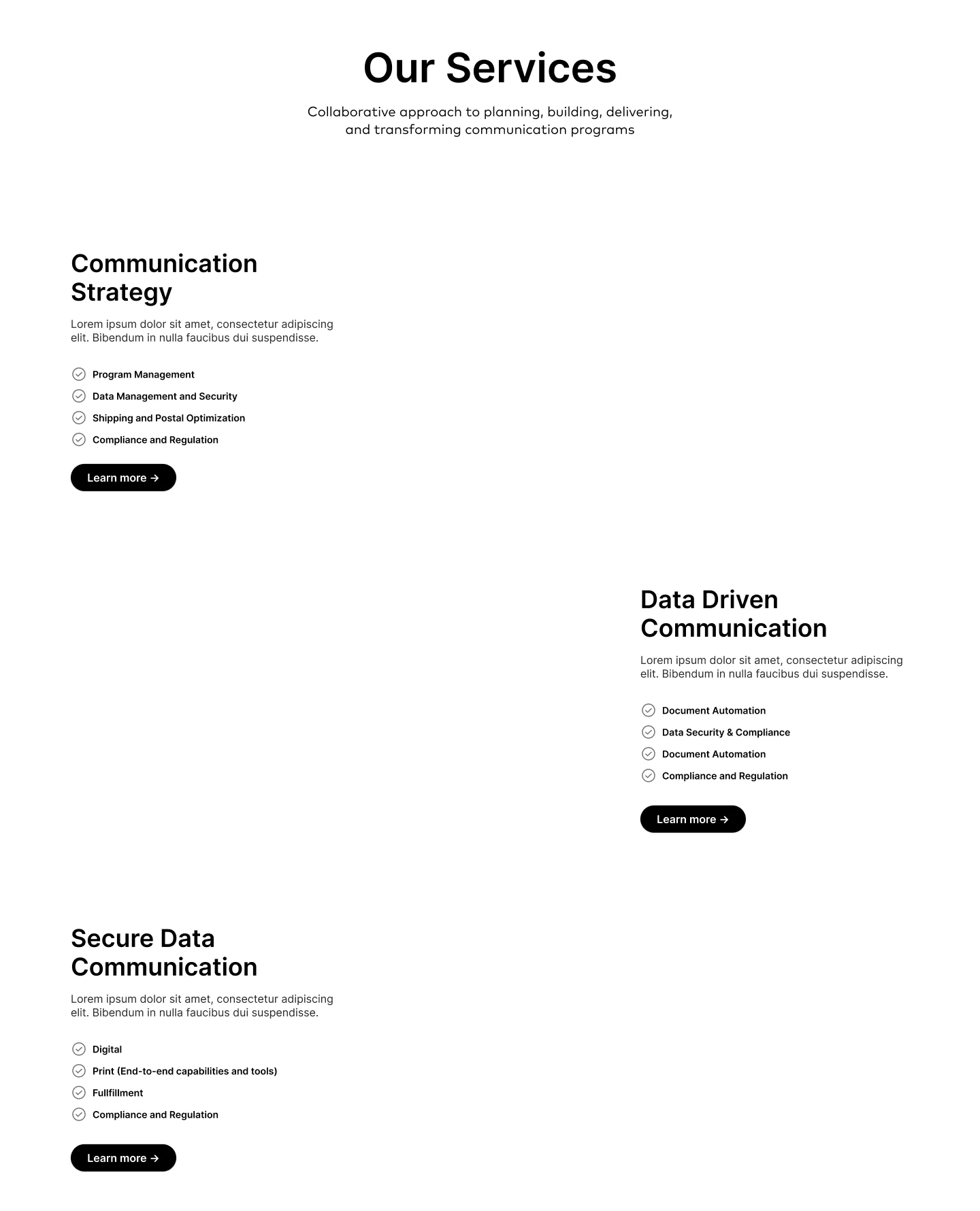
The alternative wireframe ran the services as long rows, alternating left and right, each with a checklist.
Why
KP’s offer had to read as one range, from print to data. Three equal cards show it all at once, and the stack of pages nods to KP’s print roots without spelling it out.
Decision 05: Does this look like a technology partner?
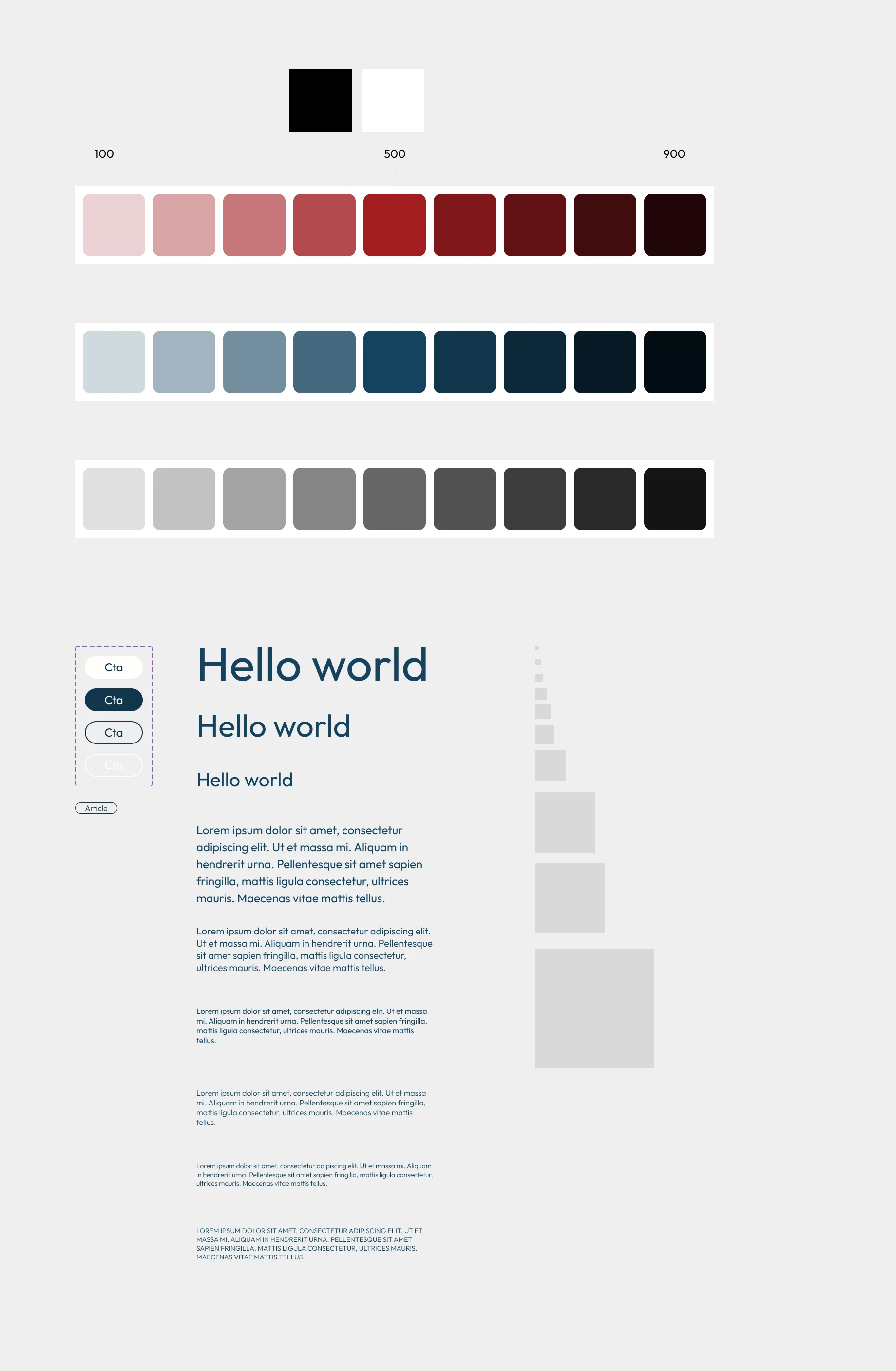
A design language that moves: navy and red, rounded edges, lines that draw.
What I designed
I set red and navy scales from 100 to 900, one typeface across a full type scale, pill buttons, and rounded cards and section edges. As the page scrolls, headings and text rise in and a thin line draws across between sections; on hover, arrow lines stretch toward where they lead.
Why
The brand brief asked for three things: expert, modern, and credible. Calm color, generous type, and restrained motion read as modern, while the navy and red keep the KP that customers already trust.
01On scroll: text rises in, and a line draws between sections
02The design language I set up in Figma
Decision 06: Does it work on my phone?
The same argument on a phone, in one column.
What I designed
On a phone, the industry list becomes a full-width accordion, each photo moves under its text, and the services stack as cards. The page makes its case in the same order as on desktop.
Why
A link a rep sends is often opened on a phone between meetings. Keeping the order of the argument means a buyer gets the same story at any width.
Result
Live since 2023, and still KP’s website today.
Still the live site
kpcorp.com still runs on the pages, design language, and interactions I designed, now on its second platform.
Built for KP’s team to grow
Pages are assembled from shared sections and cards, so KP has kept adding articles, landing pages, and new industries like Elections and Utilities on the same templates.
Part of a bigger shift
In its 2023 update, KP reported annual revenue of $80–100 million and a growing client base as it moved into data-driven communications.
I didn’t have access to the site’s analytics, so I can’t say what the redesign changed in traffic or leads. The revenue figure reflects the whole business, not the website alone.
What I’ll test next
Do new technology buyers find the proof they need before they contact sales?
Why it matters
The site is meant to be “out front for reps”: for a new buyer, it is the first sales conversation. Technology and risk teams need security credentials and integration proof before they reach out. If they can’t find them, they either leave or call with basic questions, and reps spend their time repeating the website.
HypothesisTechnology and risk buyers who start from their industry will reach security credentials and a relevant case study within two clicks, and will describe what KP does in one sentence.
- How I’d test it
- Five buyers from technology and risk roles get one task: decide whether KP could handle their compliance needs. I watch where they look and click, and ask them to describe KP afterward.
- What counts as success
- Most reach security credentials and a case study for their industry without search, and describe KP as more than a printer.
- Where it could fail
- The accordion opens one industry at a time. I’ll watch whether buyers open anything beyond the first, or miss their industry entirely.
With analytics, I’d also compare the questions in contact-form leads before and after the redesign.
What makes it different
The old site listed what KP did. The new one answers what buyers ask.
How I work
How I work in a team
Design the motion, so developers don’t have to guess.
As the project’s only designer, I worked with an art director, a PM, developers, and QA. I drew every interaction as states in Figma, at rest, on hover, and open, so the build matched the design and QA had something to check against.
How I build a system
Build the parts once, then use them on every page.
I designed the components first: navigation states, cards for services, industries, and articles, buttons, and the footer. The site’s page templates are assembled from them, which is what has let KP’s team keep the site growing without a designer.
Process
How I got here.
The working record behind the story: roadmap, business context, the audience plan and routes, sitemap options, and wireframes.
Open the full process
01Roadmap
02Business contextA business shift the website needed to explain.
03Information architectureTurning audience priorities into page hierarchy.
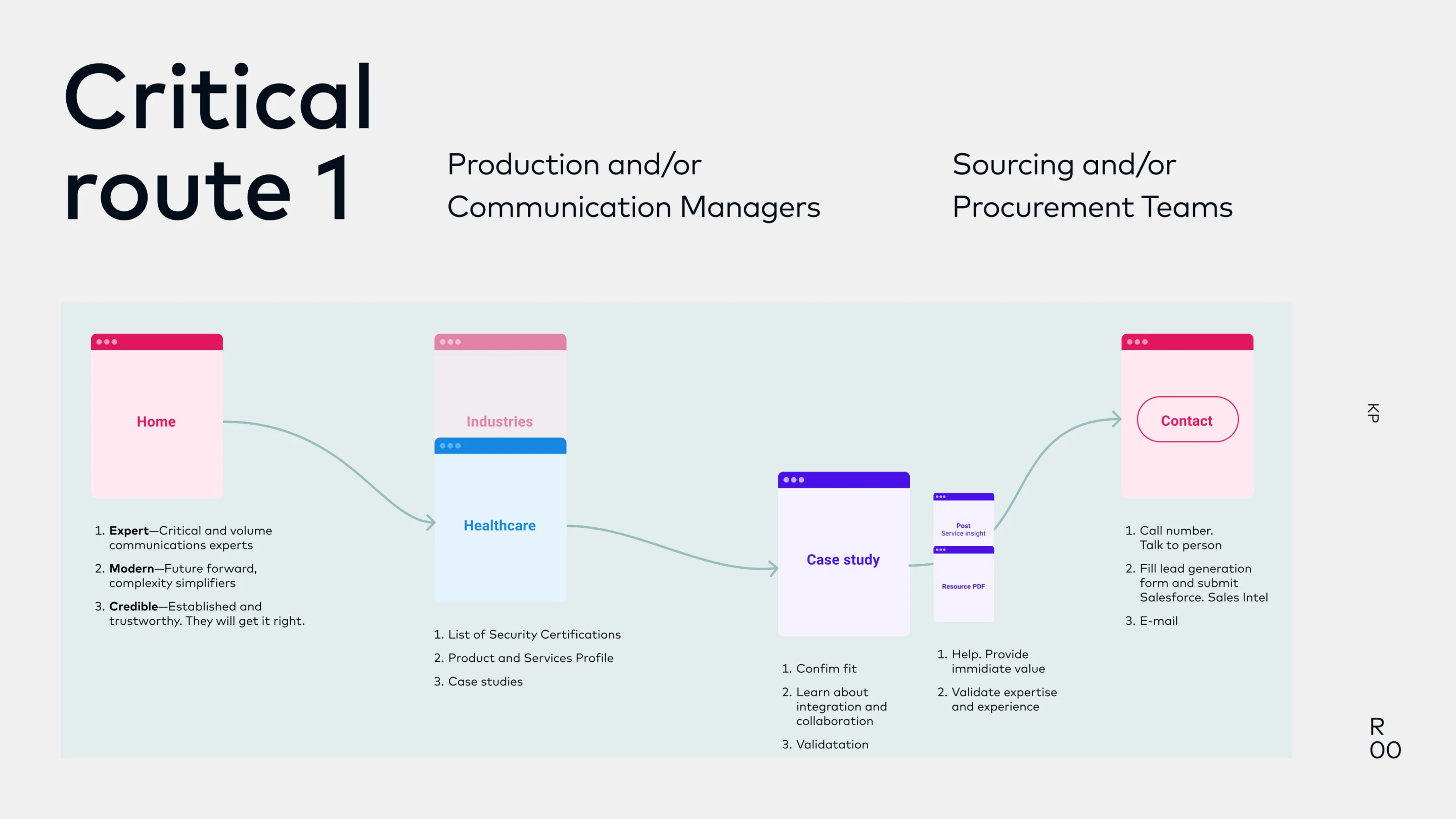
Industry route, Provided
“Do you understand our requirements?”
Inspect the full routeDesign response
Keep industry context, security credentials, and case-study evidence recognizable in the page layout before contact.
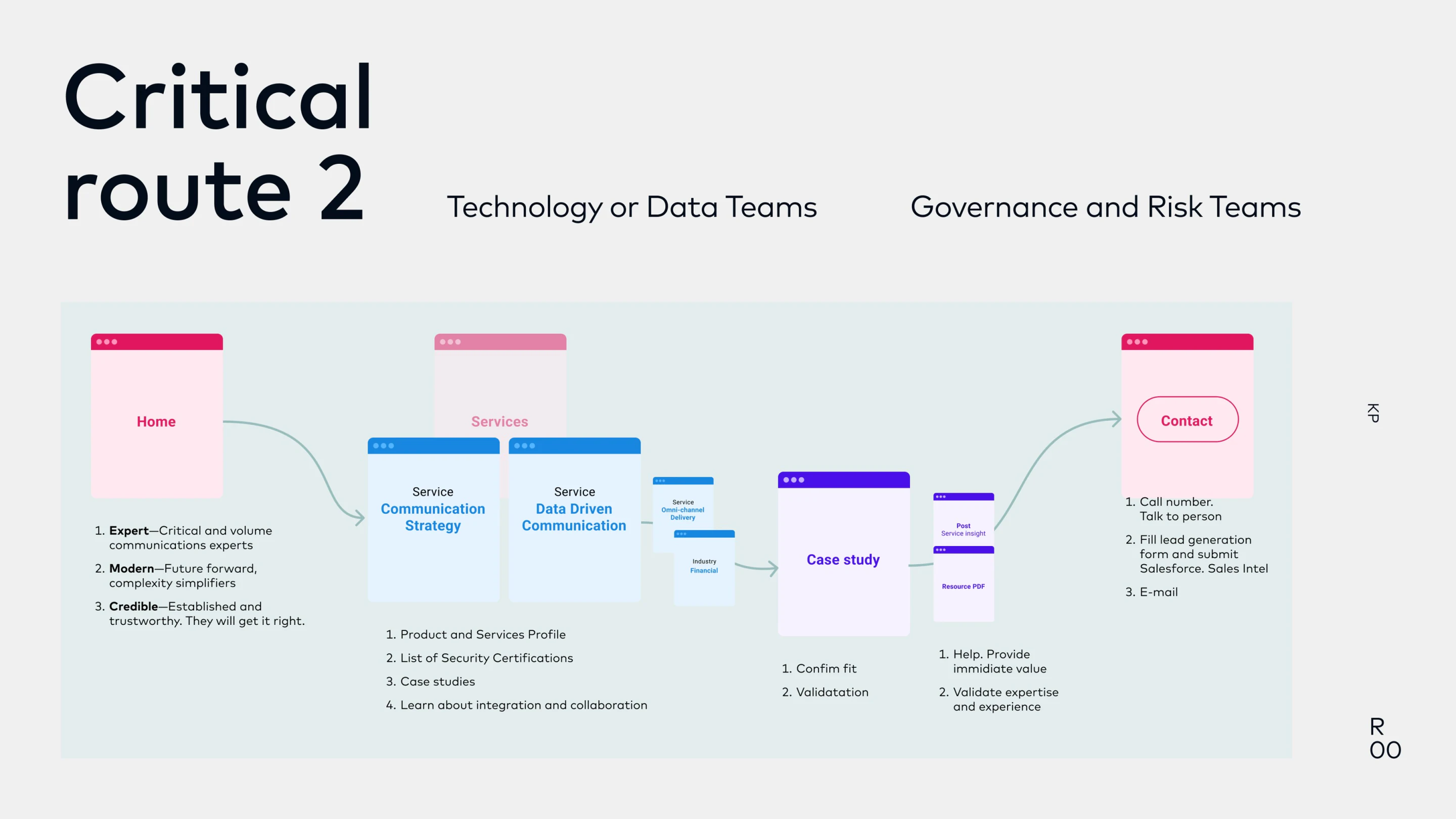
Service route, Provided
“Can your capabilities work with our systems?”
Inspect the full routeDesign response
Make service capabilities and integration evidence easy to scan, with consistent sections and a visible next step.
04Design processTranslating the brief into screens and a visual system.
Supporting inputs: four sitemap options from the client
Planning materials I interpreted when developing the interface. Expand to compare the structures and their tradeoffs.
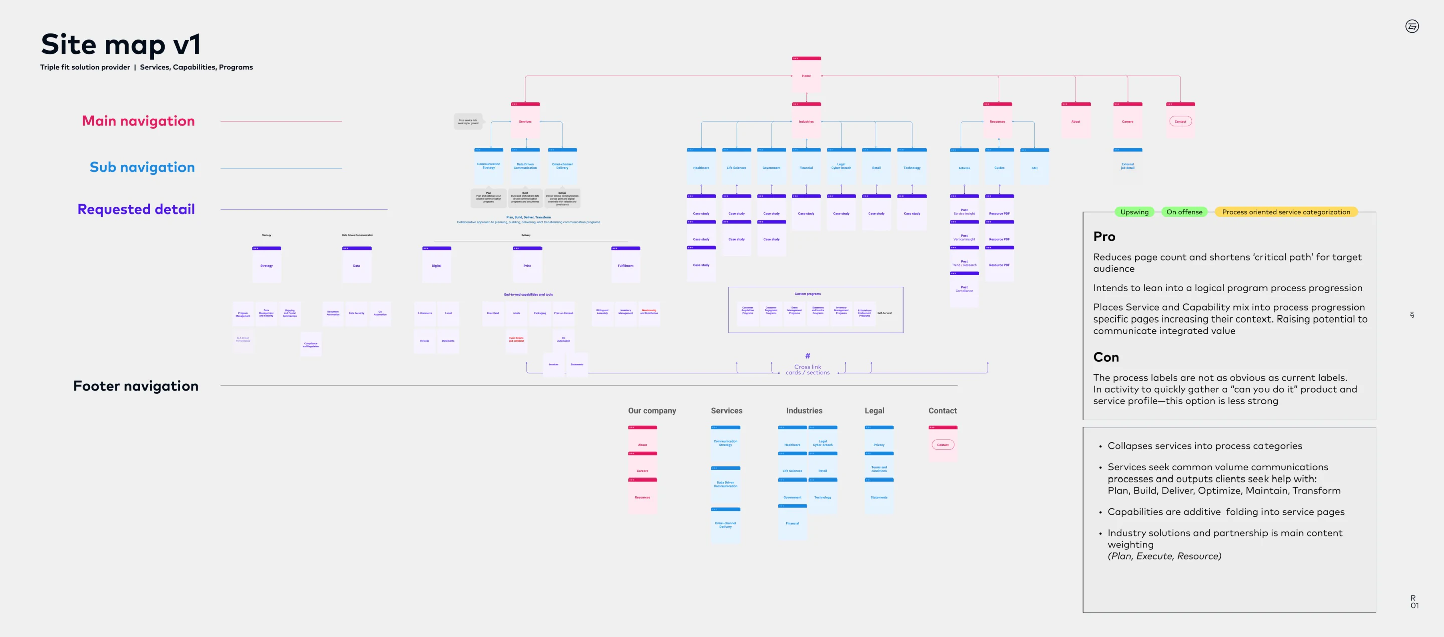
Sitemap v1, Process
Explain the integrated offer
Fewer, broader service categories could connect capabilities into a coherent process.
Inspect sitemap v1Trade-off
Less familiar labels made a quick capability check harder.
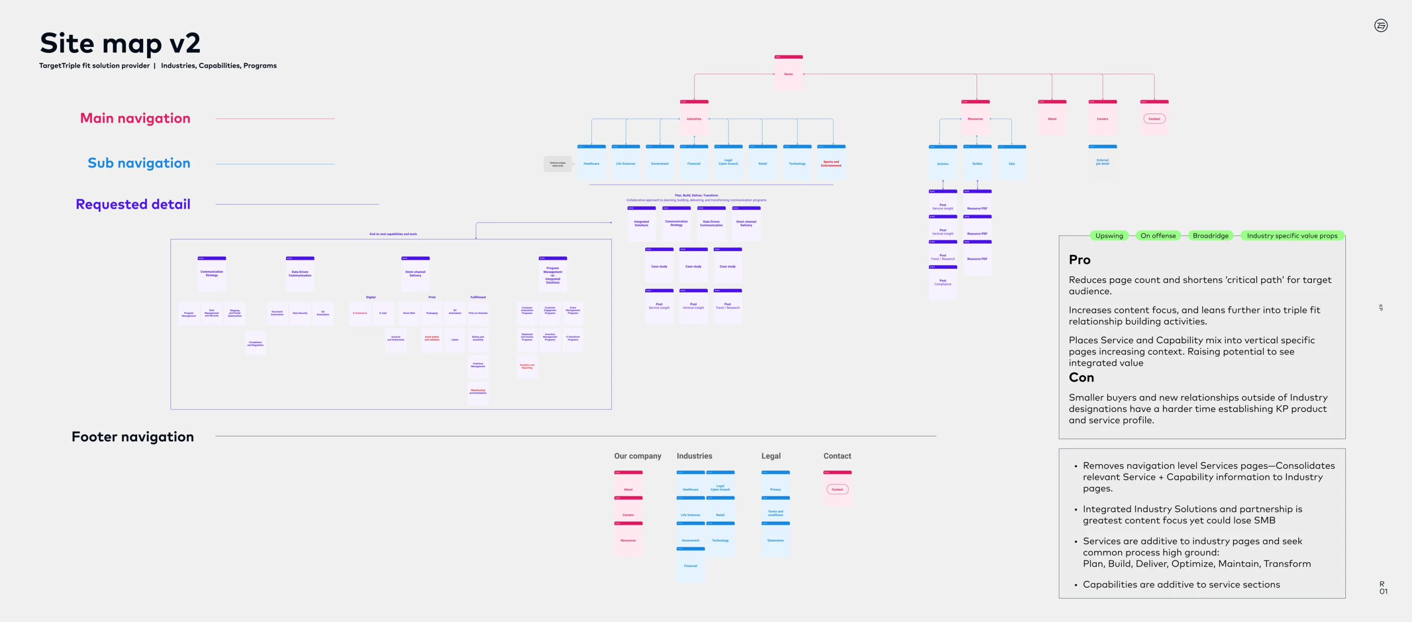
Sitemap v2, Industry
Put each customer’s context first
Services and capabilities moved into industry pages.
Inspect sitemap v2Trade-off
Visitors outside those categories could struggle to establish KP’s service profile.
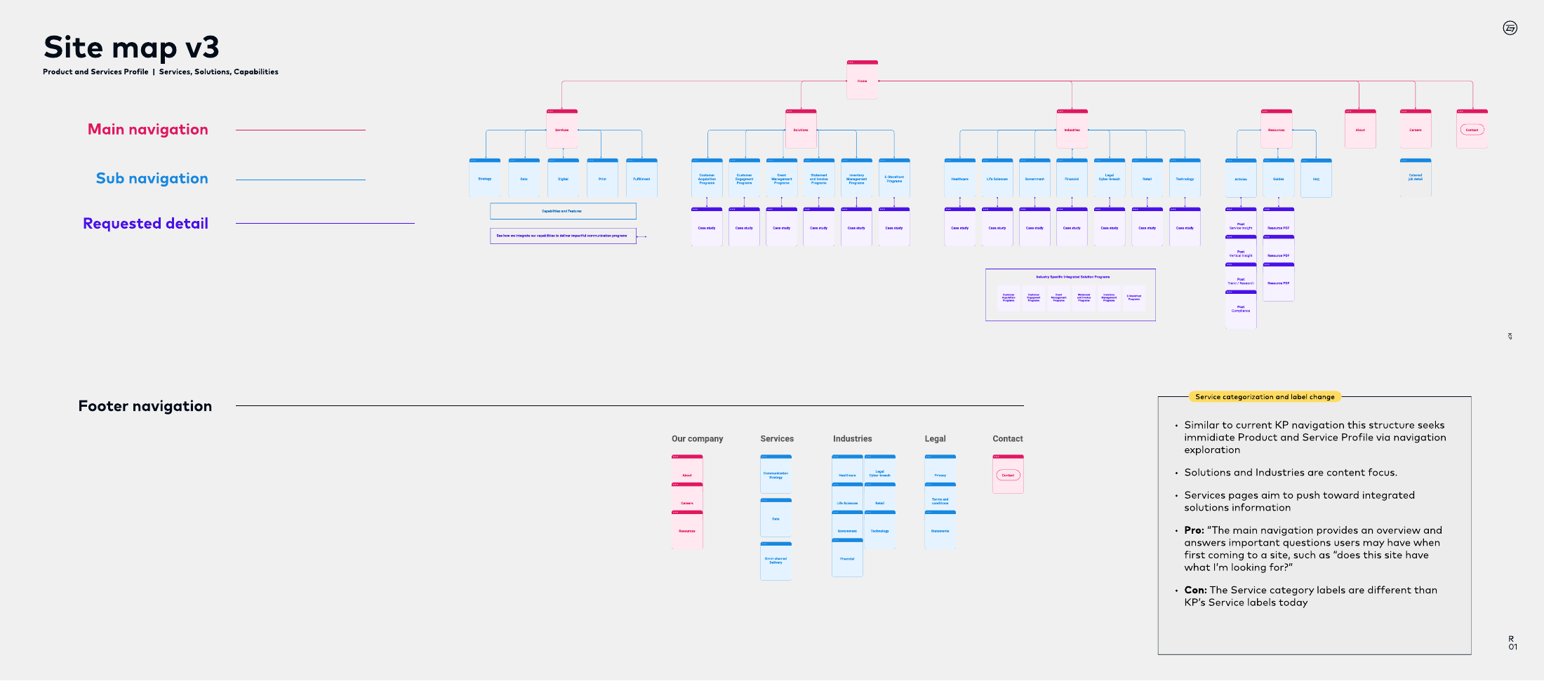
Sitemap v3, Simplified categories
Keep multiple entry points visible
Services, solutions, and industries remained distinct, with simpler service categories.
Inspect sitemap v3Trade-off
Those category labels differed from KP’s existing terminology.
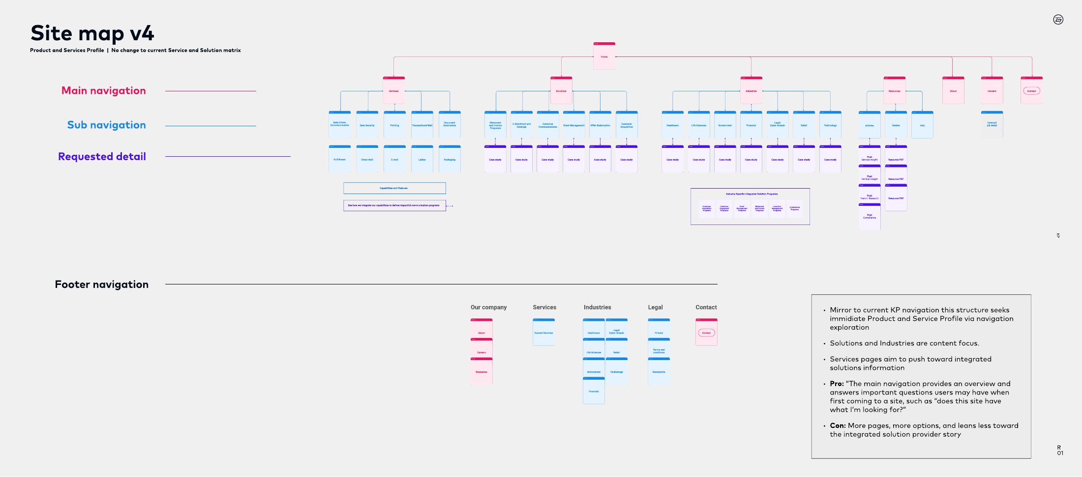
Sitemap v4, Familiar labels
Preserve recognizable service names
Retaining the existing service and solution matrix supported recognition.
Inspect sitemap v4Trade-off
More pages and choices put less emphasis on the integrated offer.