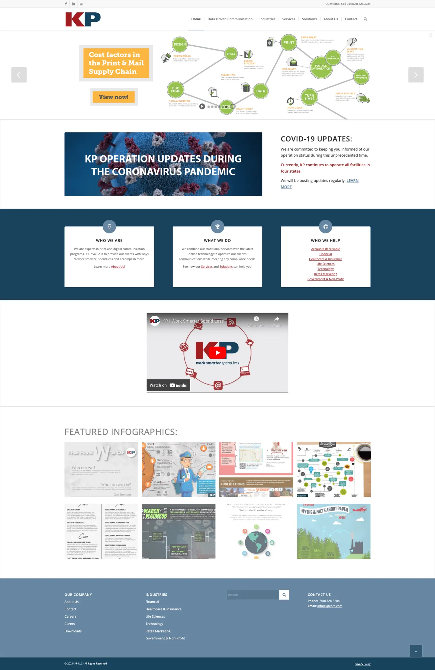
KP was selling data and technology, while its website still sold print.
Problem
By 2022 KP sold data-driven communications to regulated industries, and nothing on its homepage spoke to those buyers.
Design question
How might the homepage answer each buyer’s first question, so the site does the first part of a rep’s job?
Key insight
Two kinds of buyers arrive with different questions: teams who know KP for print, and technology and risk teams meeting it for the first time. KP’s own brief set the bar: “The web site should be out front for reps.”
My part
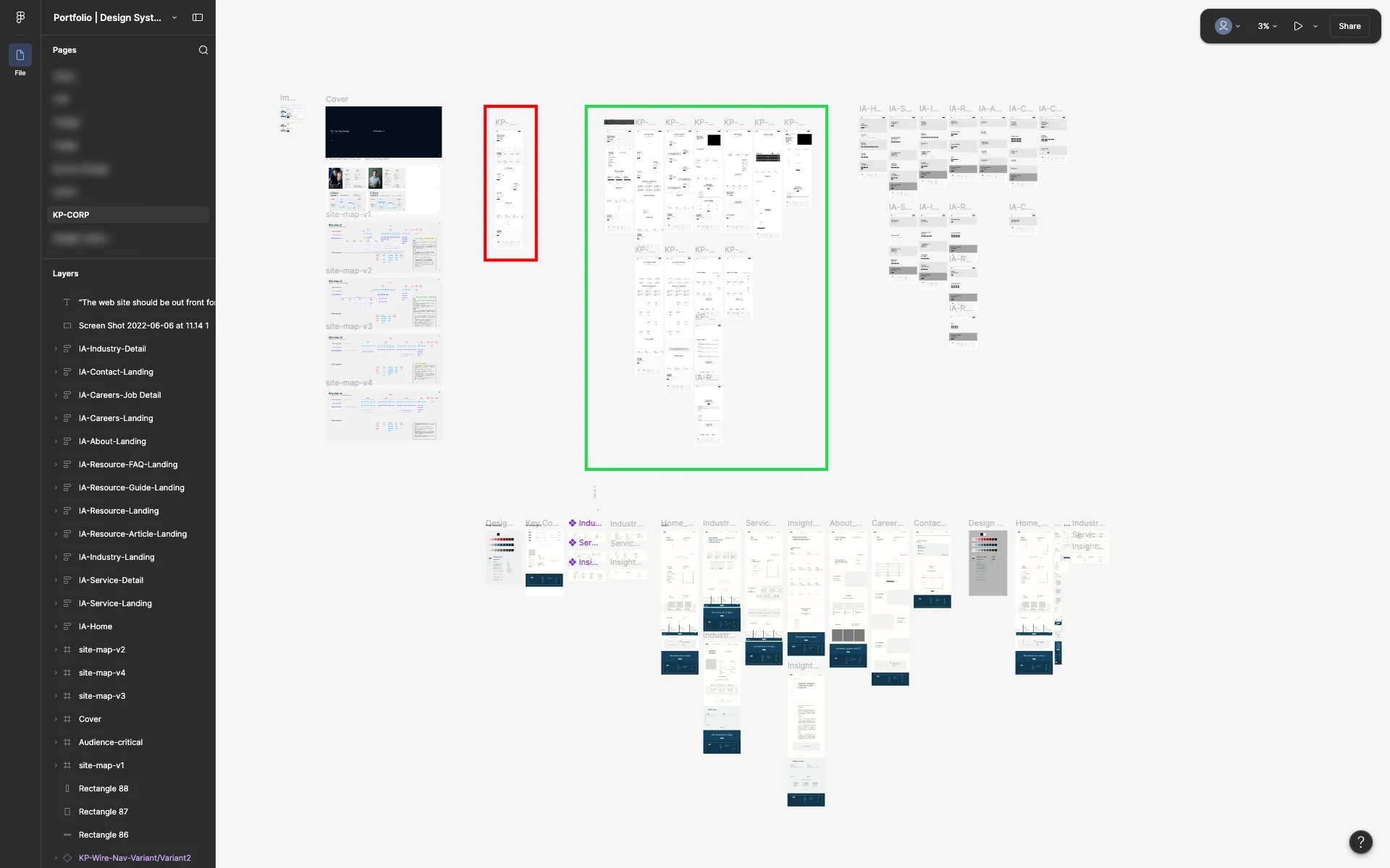
The strategy team planned the audience and the sitemap. The design was mine, working with an art director, a project manager and developers.
2Process
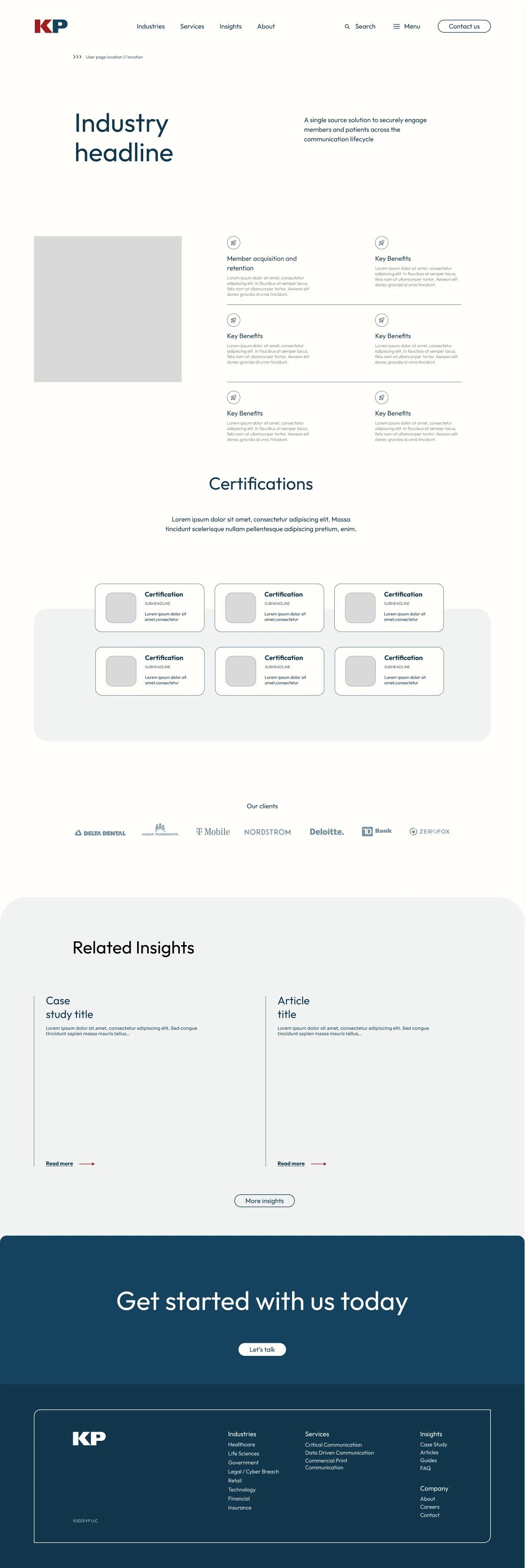
The homepage went from content blocks to what shipped.
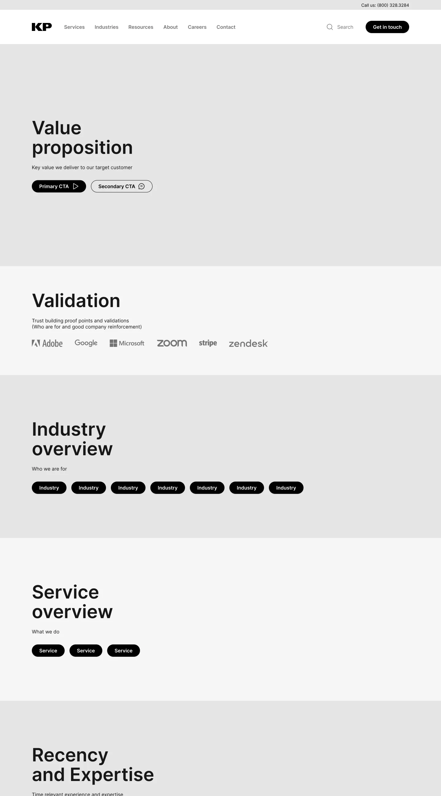
I worked through two wireframe directions, then the visual system and its motion, and drew every interaction as states, so the build matched the design and QA had something to check against.
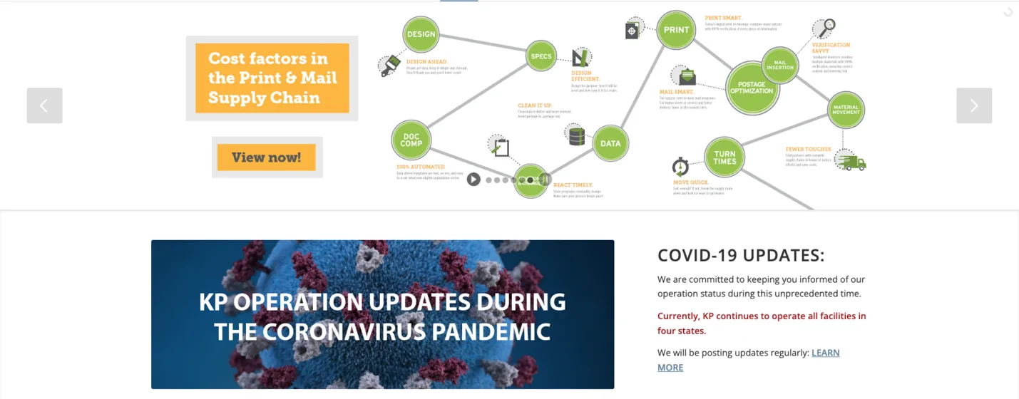
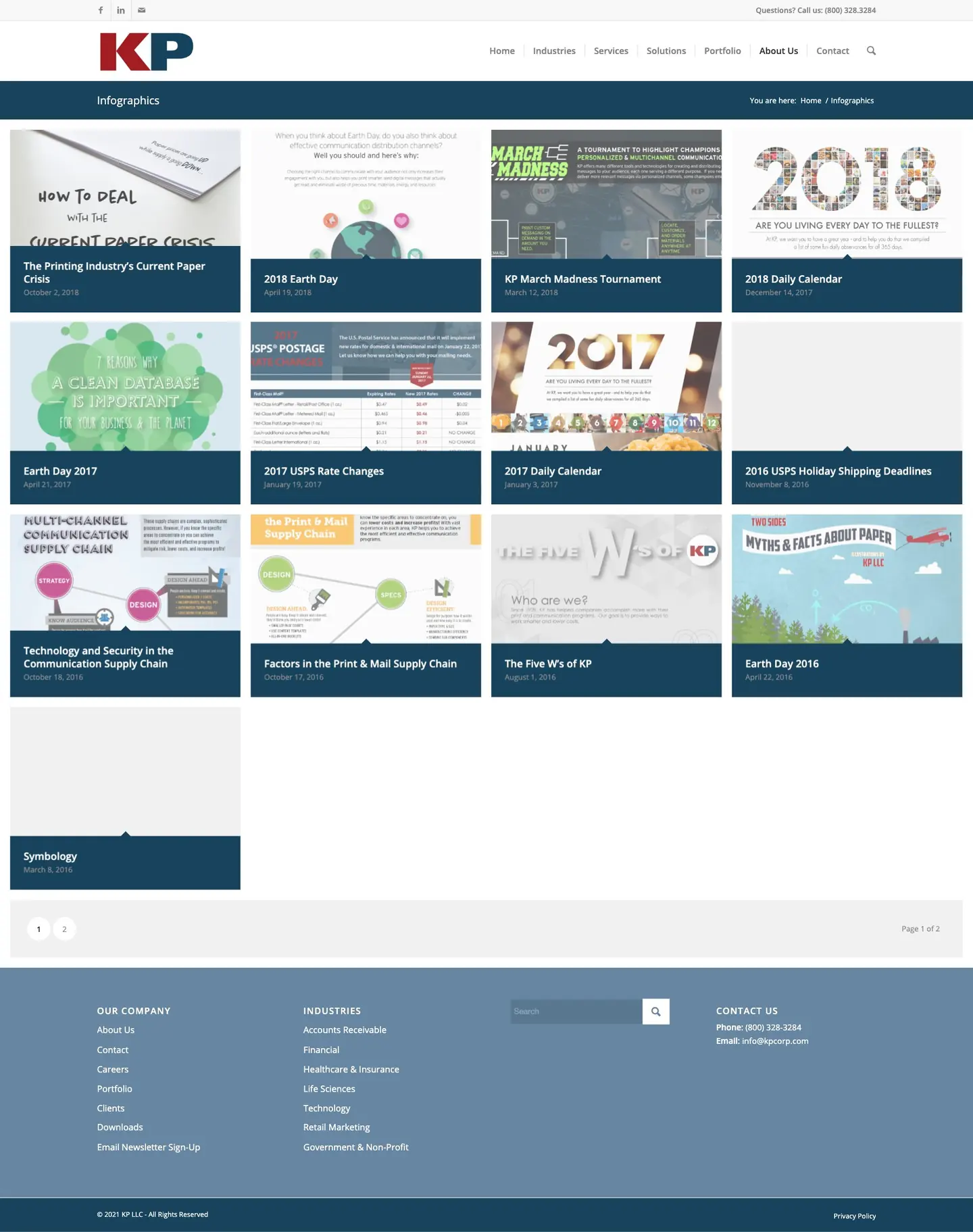
It opened on a rotating carousel of campaign graphics, then a notice about operations during the pandemic.
ChosenOn kpcorp.com today
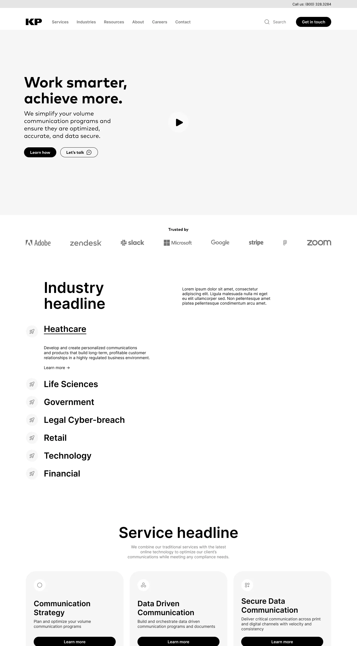
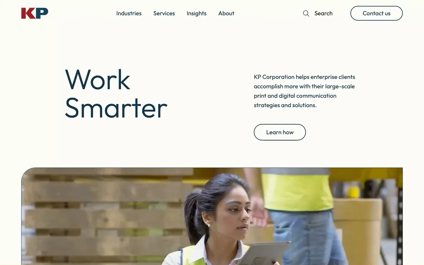
The hero says one thing, Work Smarter, beside a single line on what KP does, over video of KP’s own floor and team. Client logos follow right below it.
kpcorp.com
Why
New technology buyers needed to see a modern partner, and longtime print customers needed to recognize KP. One clear promise over real footage serves both, and the logos back it up before anyone scrolls far.
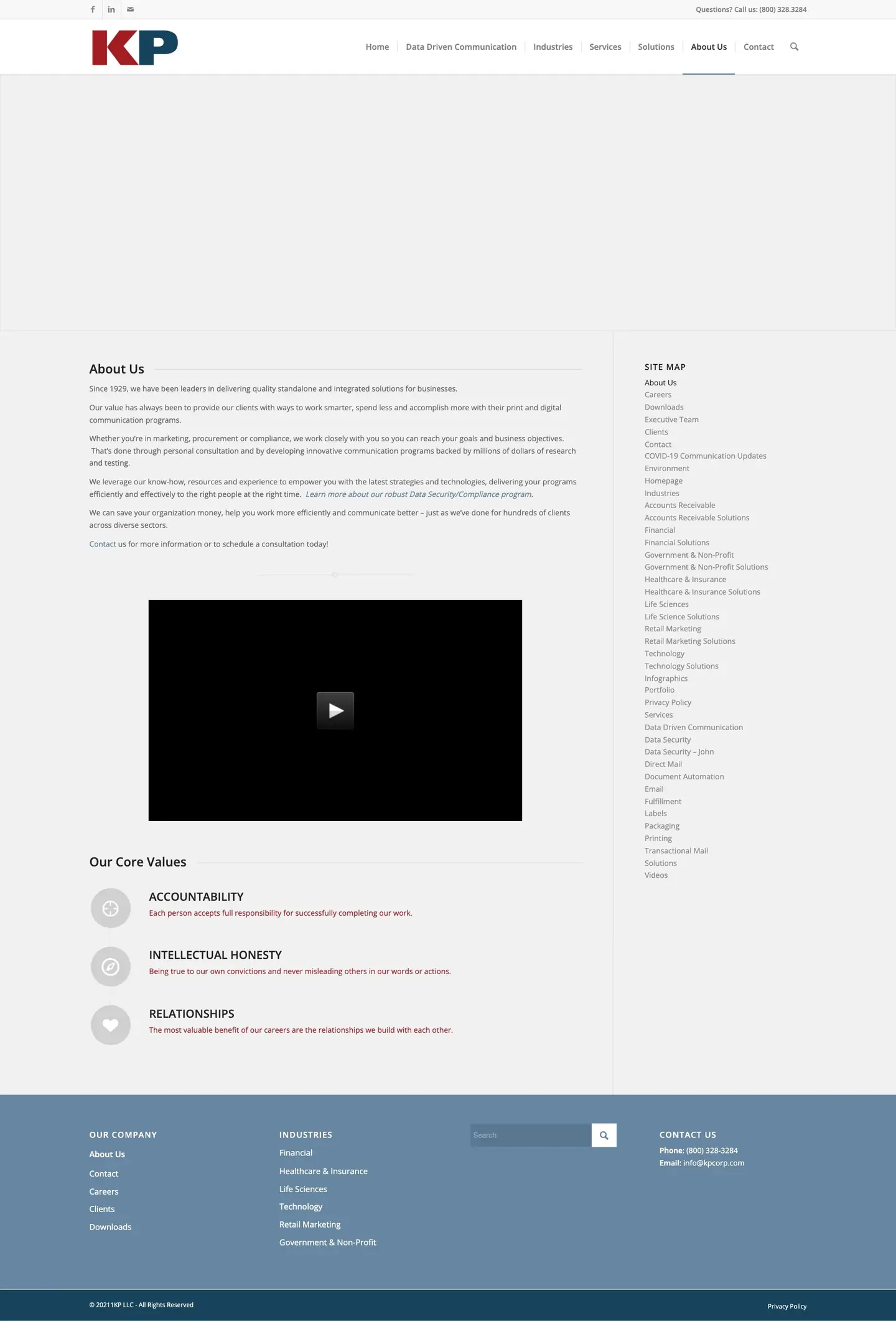
Seven items across the top, from Home to Contact, with no hint of what sat behind each.
ChosenOn kpcorp.com today
The header comes down to Industries, Services, Insights and About, with search and Contact always in reach. Each opens a menu that names every option and says in one line what it covers, the columns easing in one after another.
kpcorp.com
Why
Buyers arrive with an industry or a service in mind. Fewer, clearer doors get both to the right page, and the one-line descriptions start the sales conversation before a rep joins it.
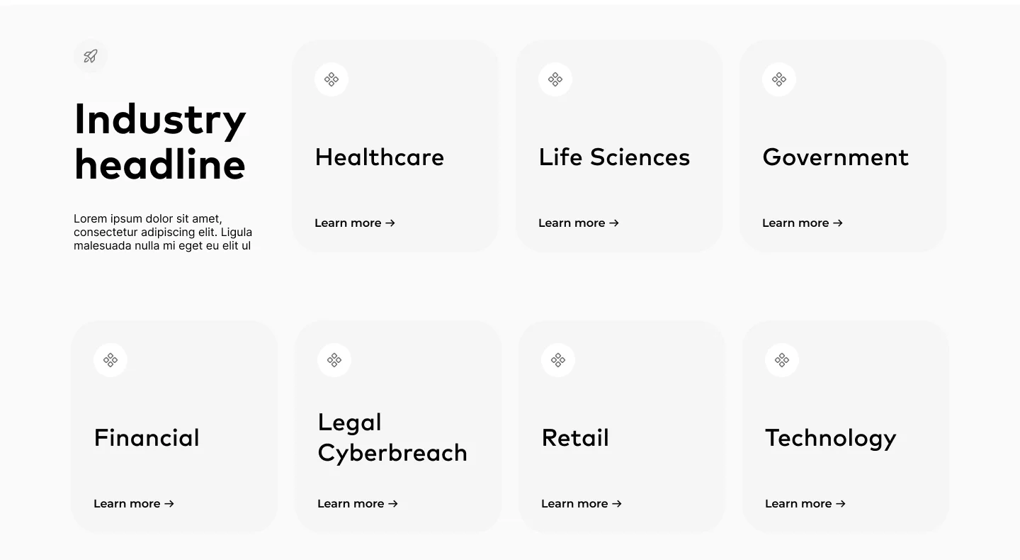
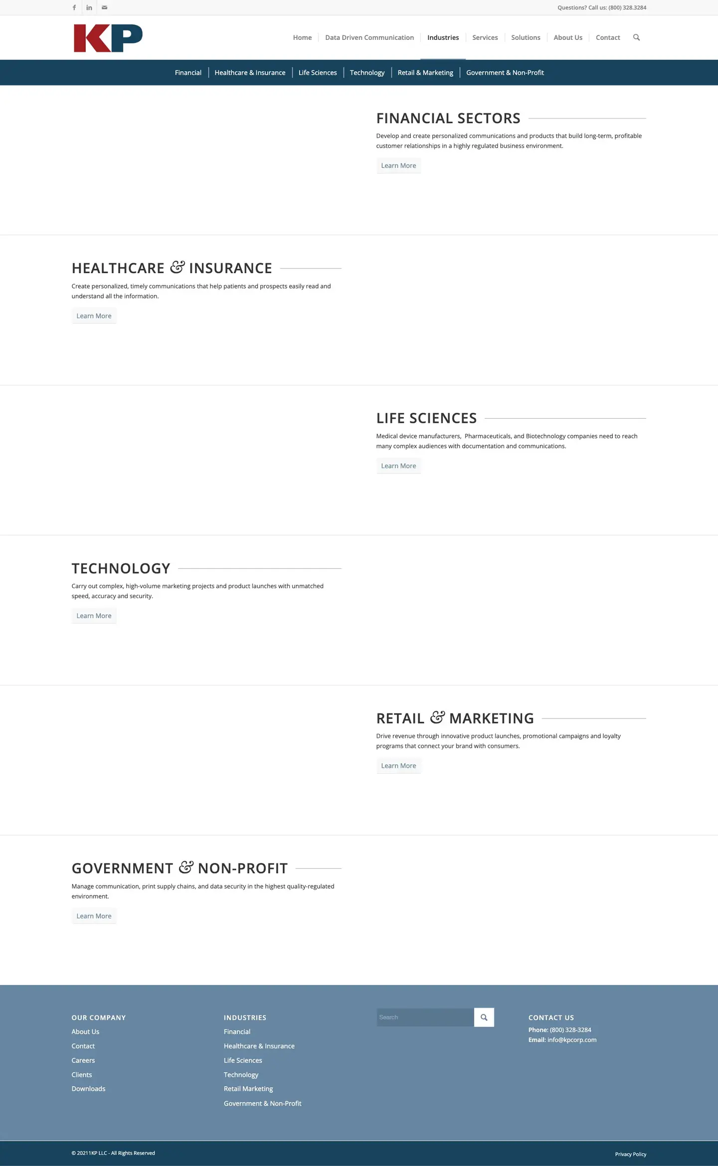
Eight equal industry tiles. Quick to scan, but each said only a name and Learn more.
ChosenOn kpcorp.com today
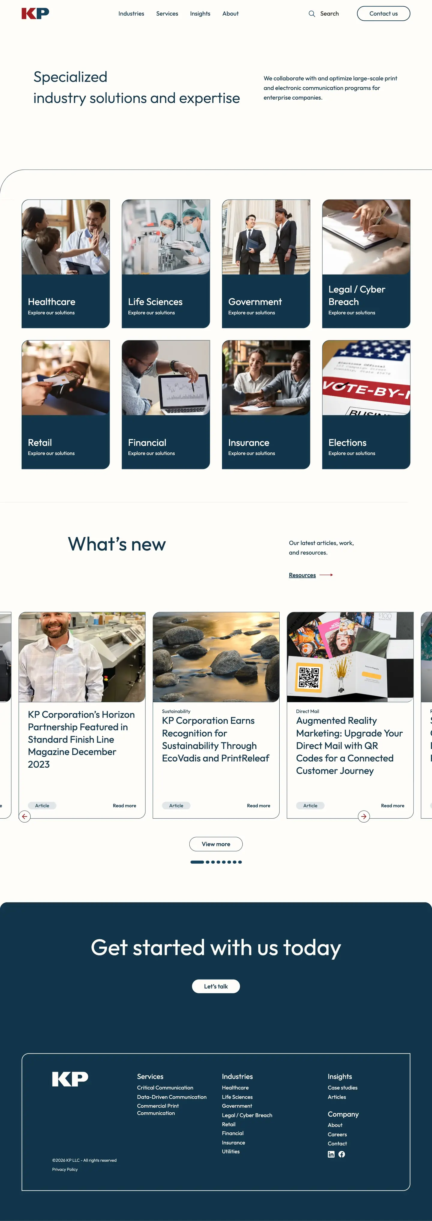
Industries sit in a list. Opening one shows a short pitch and a Read more link, and swaps the photo on a stacked card beside it, like flipping through a file.
kpcorp.com
Why
Buyers in regulated industries ask whether KP understands their requirements. A one-line answer for each industry, on demand, says more than eight equal tiles, and keeps the section short.
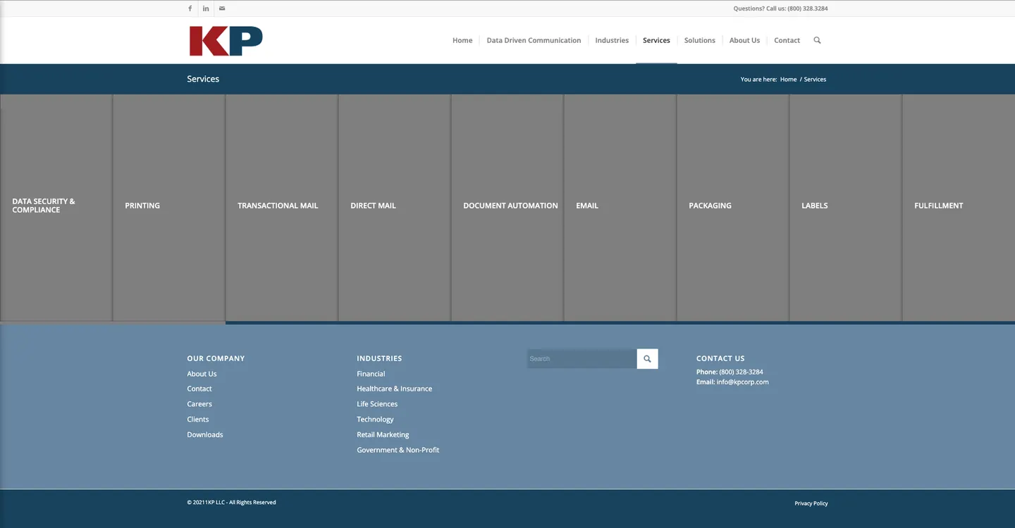
The service cards
Three cards rise out of a gray band, and hovering one fans a stack of sheets beneath it like printed pages, a nod to KP’s print roots.
4Design system
One design language, built once for every page.
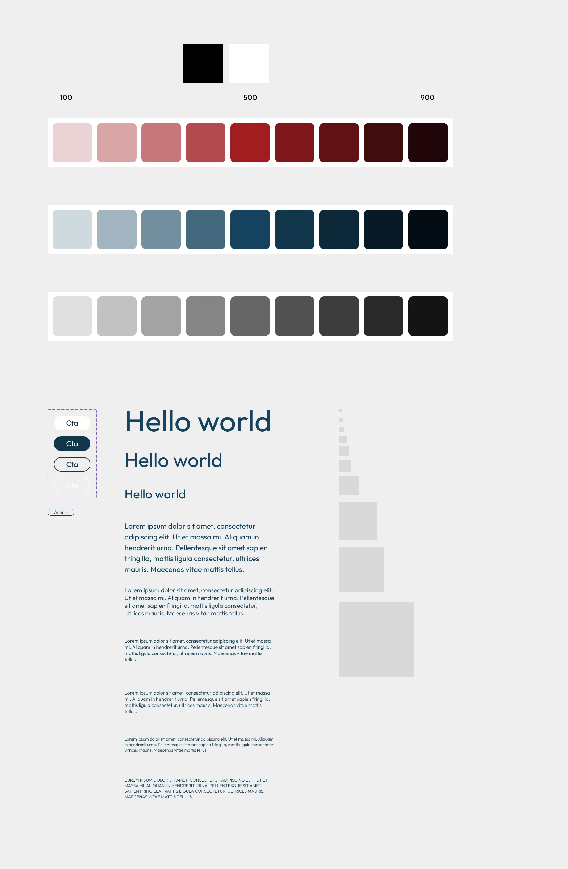
The brand brief asked for expert, modern and credible, while staying the KP that longtime customers trust. The navy and red carry that over.
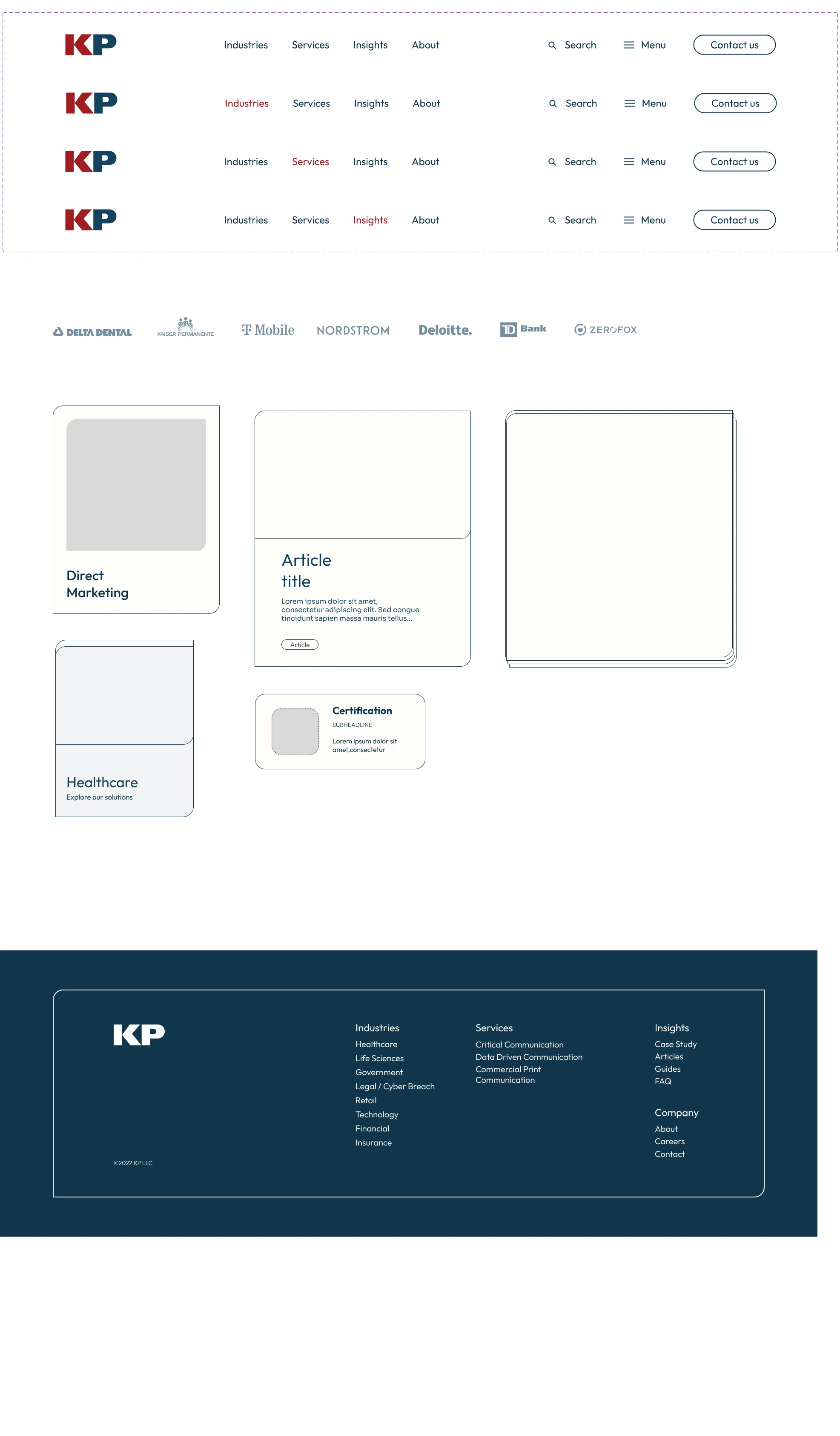
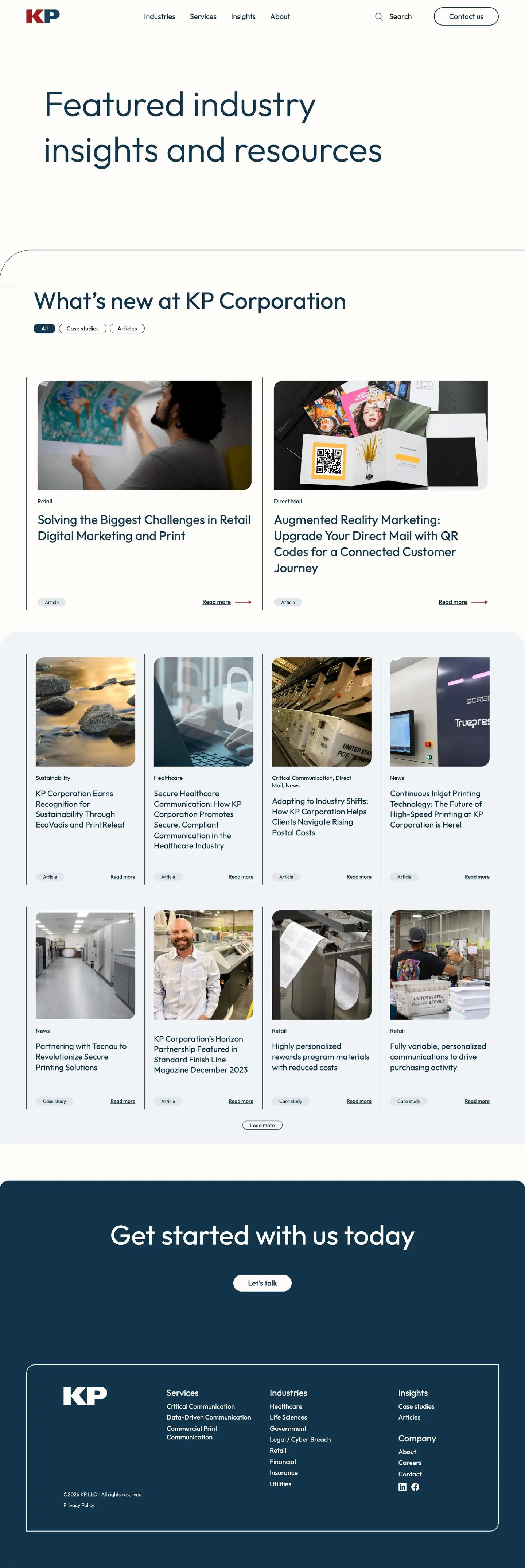
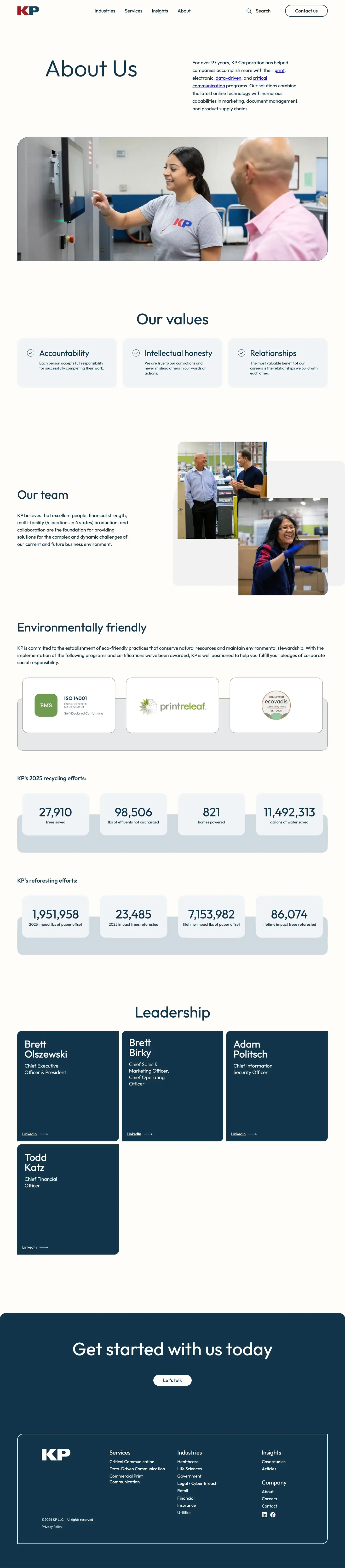
Navigation states, client logos, cards for services, industries and articles, and the footer, so a new page starts from parts that already exist.
On a phone
The industry list becomes a full-width accordion, each photo moves under its text, and the services stack, so a link a rep sends makes the same case between meetings.
Not in my file. KP added it years later, on the same template.
6Results
Live since 2023, through one change of platform.
kpcorp.com
Platform migration
The pages, the design language and the interactions all came along to the new platform.
Extended by KP
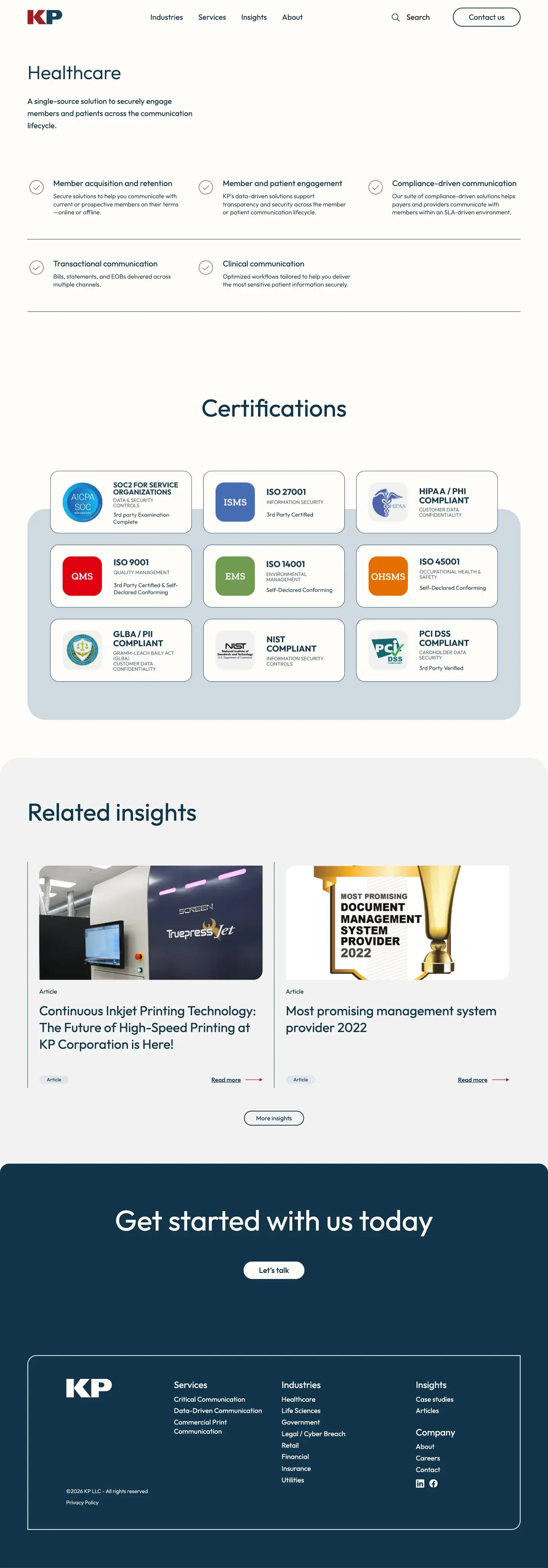
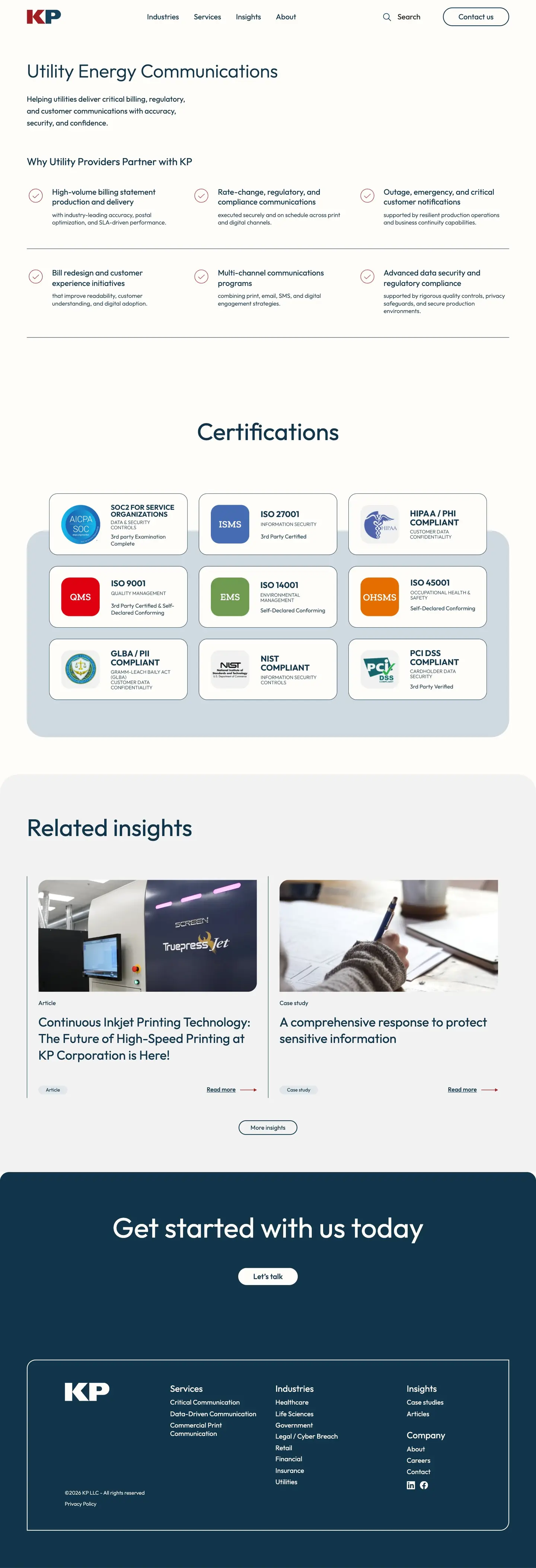
Elections and Utilities, two industries that weren’t in my file, a conference landing page and more articles.
What I learned
I came to this right out of school, straight into enterprise-level design, and I felt the responsibility of it. So I put myself in the founder’s seat, and gave KP a whole new view of its own brand.